Posts

final task/intro video

 This is the intro video that my group and I have been working on for the past couple of months. Hope you enjoy watching it. This was the first time I had attempted to do an intro for a movie. This was a cool experience, even though some parts were hard. Overall, I had fun working with my groupmates (Tasmia and Kennedy) again. I learned more about the editing process and how to film certain angels working on this project. The editing arguably took the longest and is what I learned the most about. I learned about a number of things while editing and had fun trying out different things. The editing process was harder than on the music video and challenged my skillset greater. This intro truly taught me about how much work and dedication goes into making films. 

Editing:final

Image
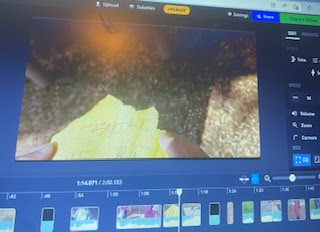
 Today I finished up the editing for the intro/project. My group and I had finished most things however there were still a few things that my group and I noticed we had to do/change. My group and I argued over the high angle I filmed and whether to include it or not. The high angle I had shot does not really look like I am in a forest and might not make sense with the story board. However, since Kennedy could not film a high angle (due to logistical issues), it was the only high angle that my group had.  So, we had to use it in order to get all of the necessary camera angles in this final. Another thing was that some of titles looked off. This was because my group and I layered two different colors over each other to create some of the the titles. To do this you have to put one color on before the other. This created an issue. In some parts the red layer would disappear leaving only the white colored title on screen before it would also disappear. This made it look weird, not uniform a

changes made after the film review

Image
 One change that I made was to make the video less glitchy. In order to do this for certain parts I had to take the clip out and put it back in. Although this took some time it made the project video look much better. Another thing I did was refilm some shots of me. My teammate Kennedy and I split up the camera angles that we still had to include. This was so that one person did not have to do all of the camera angles. We split it up amongst ourselves as Tasmia could not film due to personal reasons.  When it came time for me to refilm, I noticed that I had misplaced the ball prop that I had been using. Because I didn't want to have to refilm all of my scenes, I decided to not refilm certain shots as I couldn't without this certain prop. However, I could still get all the camera angles I needed from my running scenes. I also filmed a high angle just in case Kennedy was not able to do one. However, I doubt it will be used as it doesn't really look like I'm in a forest. A

changing music on the final project

Image
 Today I was going over my project to see what else I could do. While listening to the music that my group and I had chosen I thought something was off. The music sounded ok, but I went to go look for music to see if I could find one that sounded a little better. I started off by just looking up creepy/mysterious songs. That is until I remembered that I needed to find one that was royalty free. I looked on a bunch of different websites that had royalty free music on them. I found a few I liked. However, I narrowed it down to just one song as the other three did not really fit the video. Things such as the songs being too fast or to slow (not aligning with what was happening). After this I had to talk to my teammates. I told them about the song that I thought would be a better fit and at first, they were hesitant. This was mainly due to the fact that the editing was pretty much done by the point. However, after they listened to it, they agreed that this song was a better fit then the so

Film Review

Image
 Today I showed my final project to a group of people in my class. They had some suggestions. One suggestion was to make the black screens take up less time. Or shorten them a little. This was due to the fact that some of the black screens seemed to be a little longer than necessary/seemed dragged out. They said that this was really only a problem for the black screens that were a bit longer that didn't have any titles/dialogue over them. Another recommendation that my classmates made was to make it a little clearer what the characters are running towards in the scenes that just show them running. They also mentioned how the scenes that are supposed to be in a forest don't really look like they were filmed in a forest. So, they recommended that if we could refilm in a setting that had more trees/a more forestry setting. My classmates also said that in some scenes the footage seems to glitch to another image before going back to normal. They suggested to take those clips out and

continuing to edit the final

Image
 Tiday, I finished up the editing for this project. The first thing I did was move some of the titles slightly. Some of the titles had been moved by one of my teammates. But did not follow the order that the titles were supposed to be in. I also changed showing the actors names all at once. I instead put the actor's names one by one. As one name faded off the screen another one would pop up. I also changed the font. It turns out that my group and I had picked out a font to use beforehand and had forgotten about it. It was only when I read the very last part of the title design that I remembered. However, my group and I ended up having to change the font we would be using as it was not available on the editing software we were using. Instead of using the Centeria Script font like we had originally planned we used the Arial font. I also changed the colors on the titles after one of my teammates suggested it. This was to keep the titles the same color/colors throughout and to make the